That moment matters more than most teams realize.
In a few seconds, users decide:
- Is everything under control?
- Is this product helping me?
- Do I know what to do next?
After years of designing SaaS platforms, I've learned one thing:
If users feel confused, overwhelmed, or unsure where to look, the dashboard is failing — no matter how beautiful it looks.
Here's how to design one that actually works.
Start With the User's Morning Question
Every good dashboard starts with one simple question:
Why is the user opening this right now?

Most SaaS users log in to:
- Check performance
- Spot problems
- Track progress
- Take action
They're not logging in to admire your UI.
So instead of asking, "What metrics can we show?" ask:
- What decision does the user need to make today?
- What would help them feel confident within 30 seconds?
- What information would cause anxiety if it were missing?
Structure Matters More Than Style
A beautiful interface won't fix a messy structure.
Strong dashboards follow a clear hierarchy. I like to think of it in three layers:

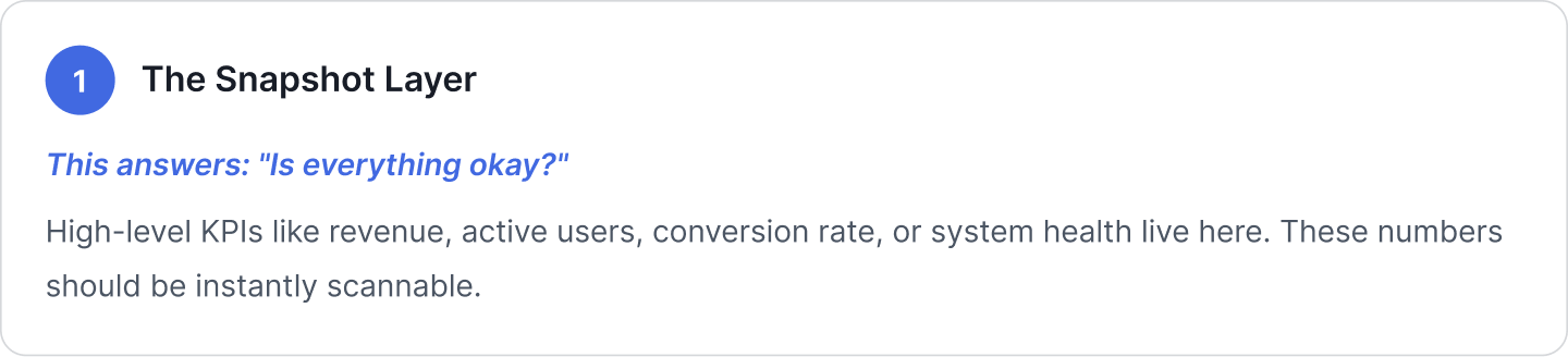

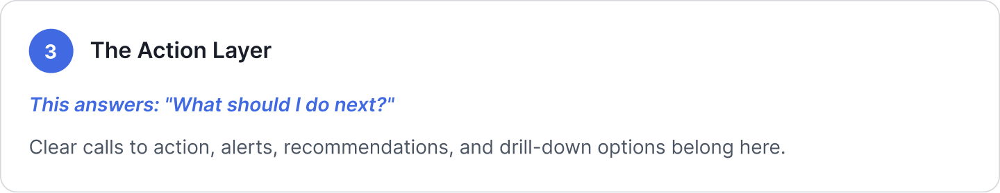
When these layers are organized well, users don't feel overwhelmed. They feel guided.
Design for Scanning, Not Reading
Nobody reads dashboards word by word. They scan.
That means:
- Logical grouping
- Consistent card layouts
- Clean spacing
- Minimal visual noise

Consistency builds pattern memory. If green always means healthy and red always signals risk, users don't have to relearn the interface every time.
Remove Vanity Metrics
One of the most common mistakes? Filling dashboards with impressive-looking but useless numbers.
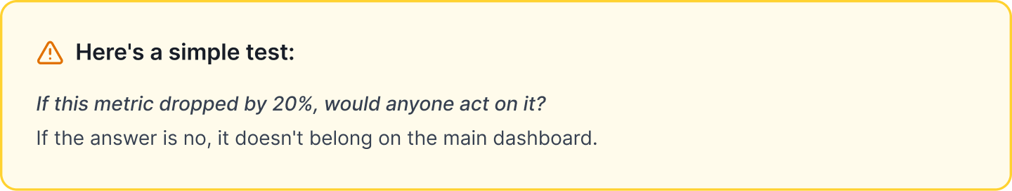
Focus on:
- Actionable metrics
- Business-critical indicators
- Leading signals, not just lagging results
Design for the Real World
Dashboards don't exist in perfect conditions.
There will be:
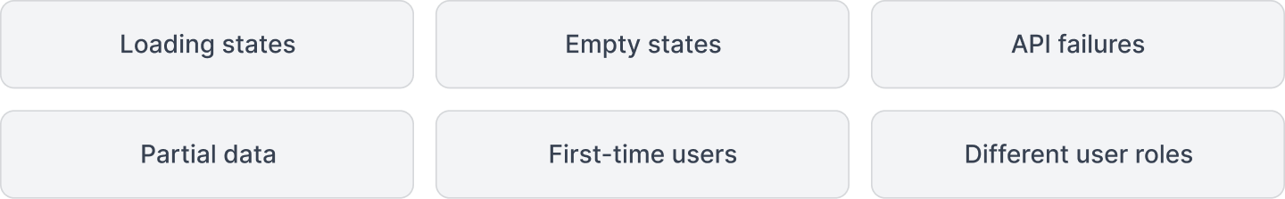
New users shouldn't see a dead screen.
Power users shouldn't feel restricted.
Admins shouldn't see irrelevant widgets.
A mature dashboard anticipates these realities.
Keep Low Cognitive Load
SaaS products are already complex. The dashboard should simplify that complexity — not add to it.

Avoid:
- Too many widgets per row
- Overloaded filter panels
- Unrelated chart types crammed together
- Excessive color
🟢 Use whitespace intentionally.
🟢 Limit what's shown by default.
🟢 Let users explore deeper — but don't force them to.
Make Filters Smart, Not Stressful
Filters are powerful — but they can quickly become overwhelming.

The best filters:
- Offer a clear global date selector
- Show active filters clearly
- Remember user preferences
- Use smart defaults
- Avoid unnecessary dropdown overload
When filters are designed well, they feel almost invisible.
Design for Growth
As SaaS products grow, everything expands:

Your dashboard should grow with it.
That means building something:

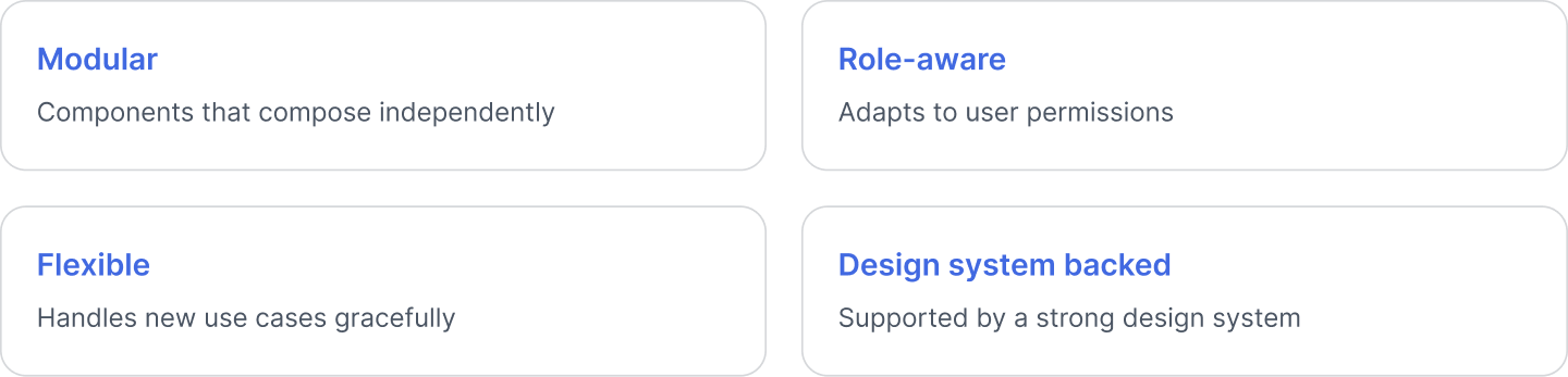
Avoid rigid layouts that collapse under scale. Think long-term from day one.
Final Thoughts
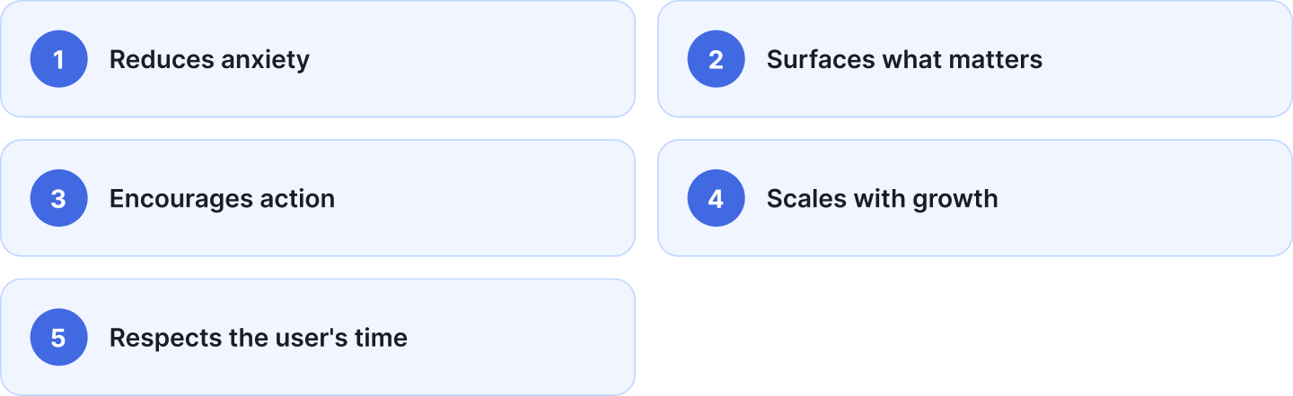
A great SaaS dashboard does five things well:
If your dashboard feels crowded, confusing, or passive — it's worth rethinking.
Because at the end of the day, dashboards aren't about charts.
They're about clarity.